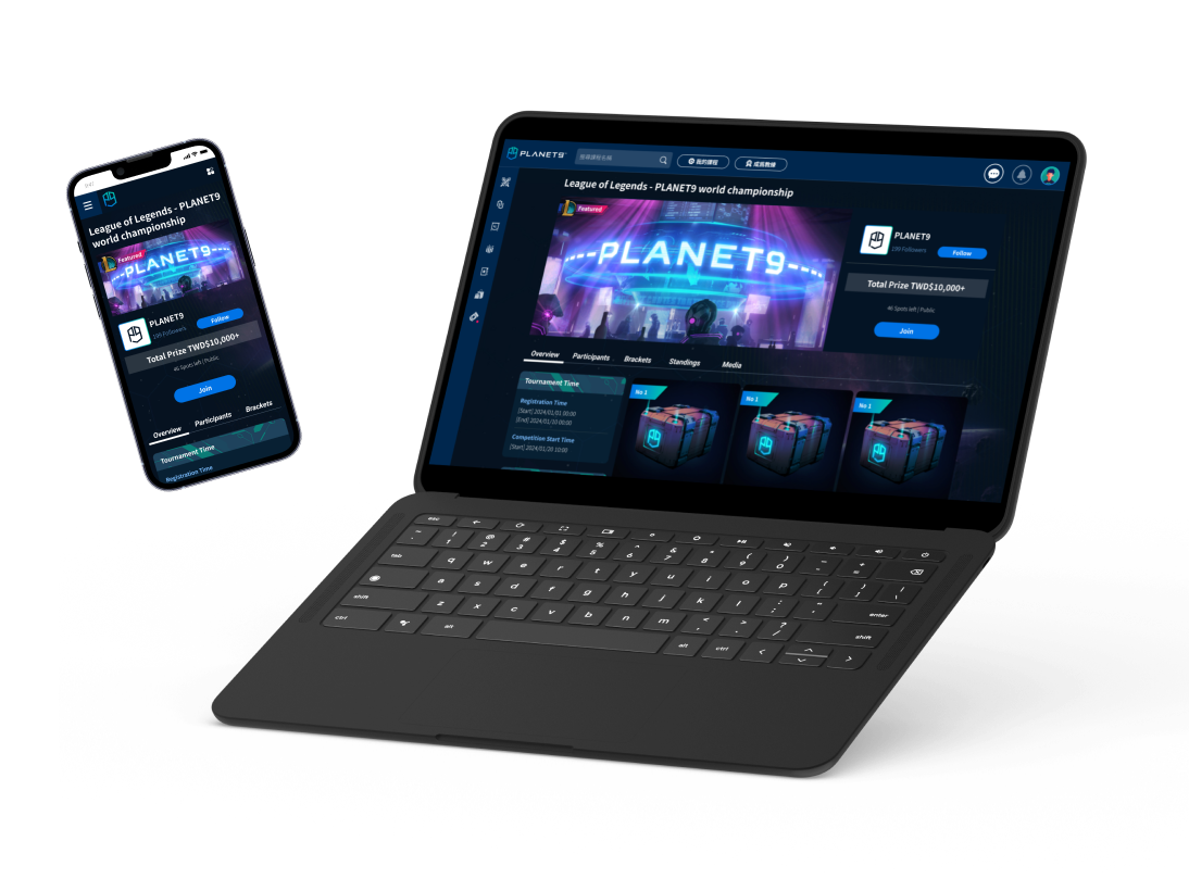
Company: Acer - PLANET9 - Store
Team: Store Product Manager / Front-end Engineers / Back-end Engineers / QA Engineer...
My role: UIUX Designer
Deliverables: Ideation / Wireframe / UI Mockup / Interactive Prototype / User Testing...
Context /
PLANET9 Store is an online marketplace catering to gamers and esports enthusiasts. It offers a range of gaming products, including peripherals, hardware components, and branded merchandise.
(Store's services are currently available in Taiwan only.)
Pain points /
There were a lot of usability issues and inconsistencies across the entire Store website, this led to a high user drop-off rate, which harmed our brand and revenue.
Goals /
Redesign the checkout process to drive revenue growth.
Provide a consistent and seamless look and feel that aligns with PLANET9's brand.
Fix usability issues and improve the overall design.
User Journey
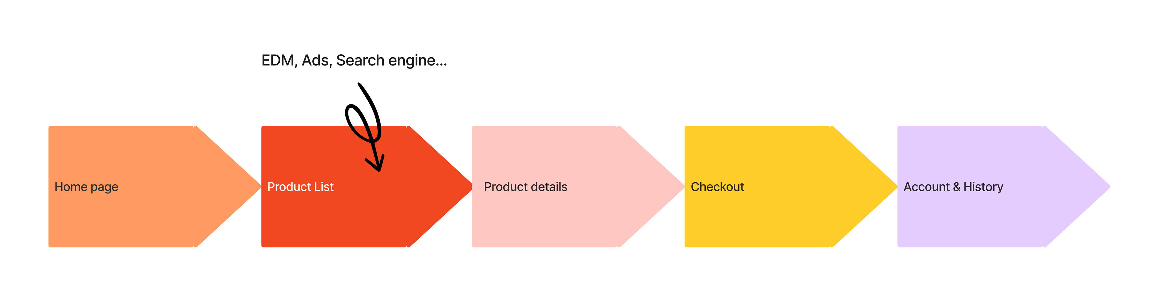
Based on Google Analytics, the entry point with the highest traffic is actually the product list page, not the home page. This is likely due to various marketing campaigns and social media posts that link directly to those specific product pages.
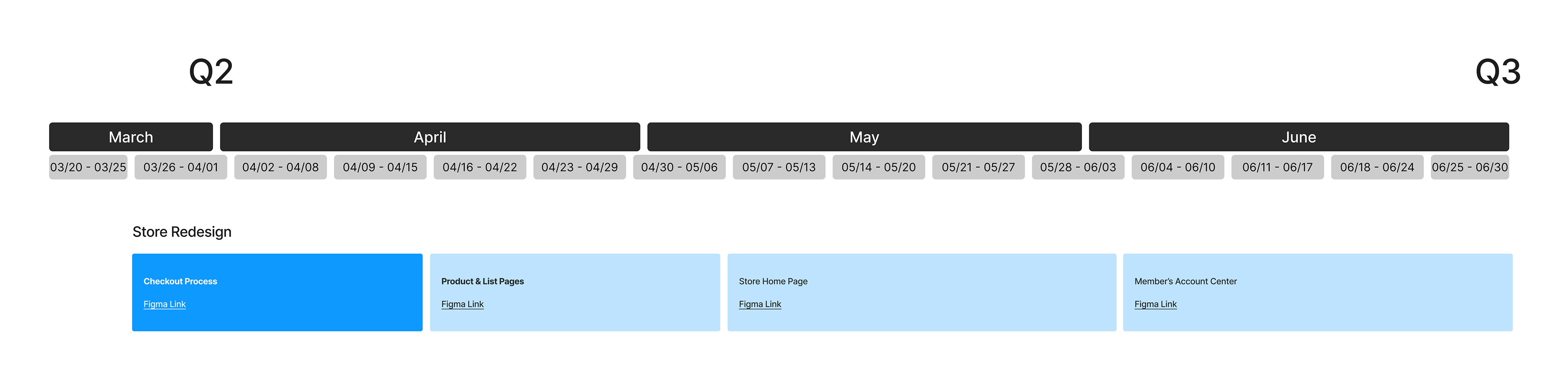
Project Planning
After analyzing the user journey, I broke down to smaller scopes for the entire project with Store product manager, we actually prioritize the stages backwards since the urgent issues were on the checkout process, and the usability issues could be fixed rather quickly.
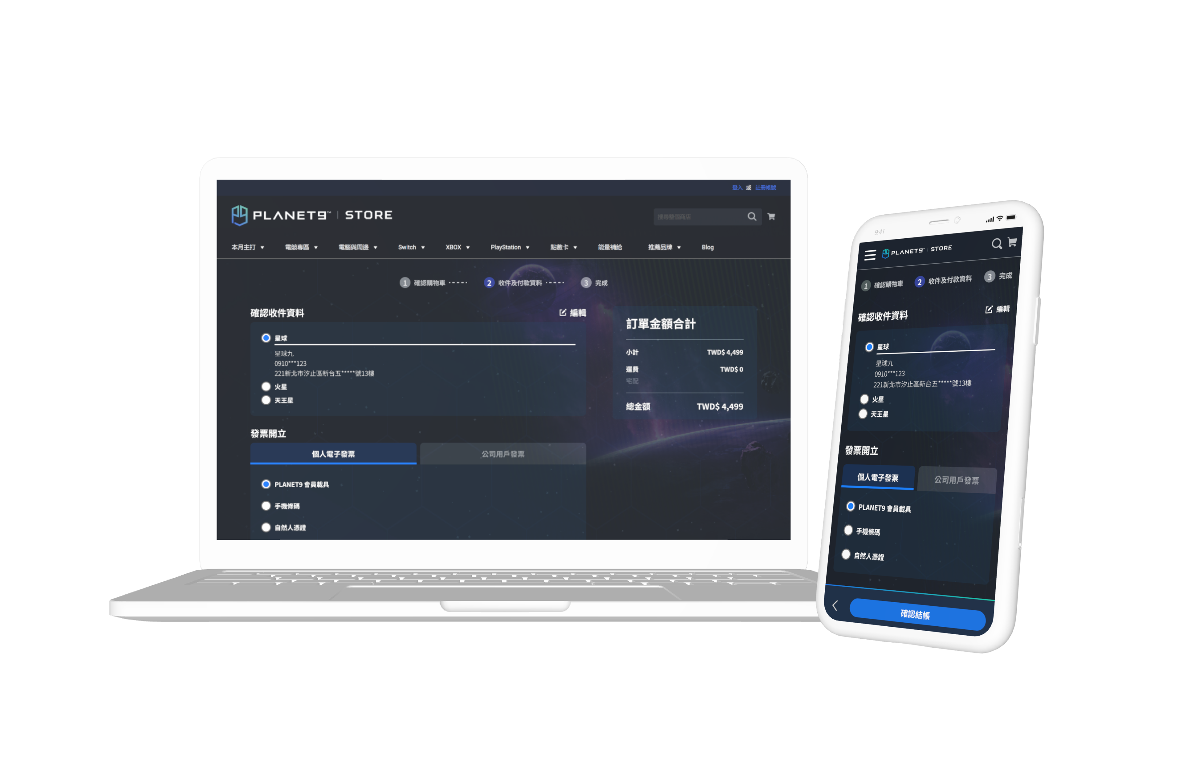
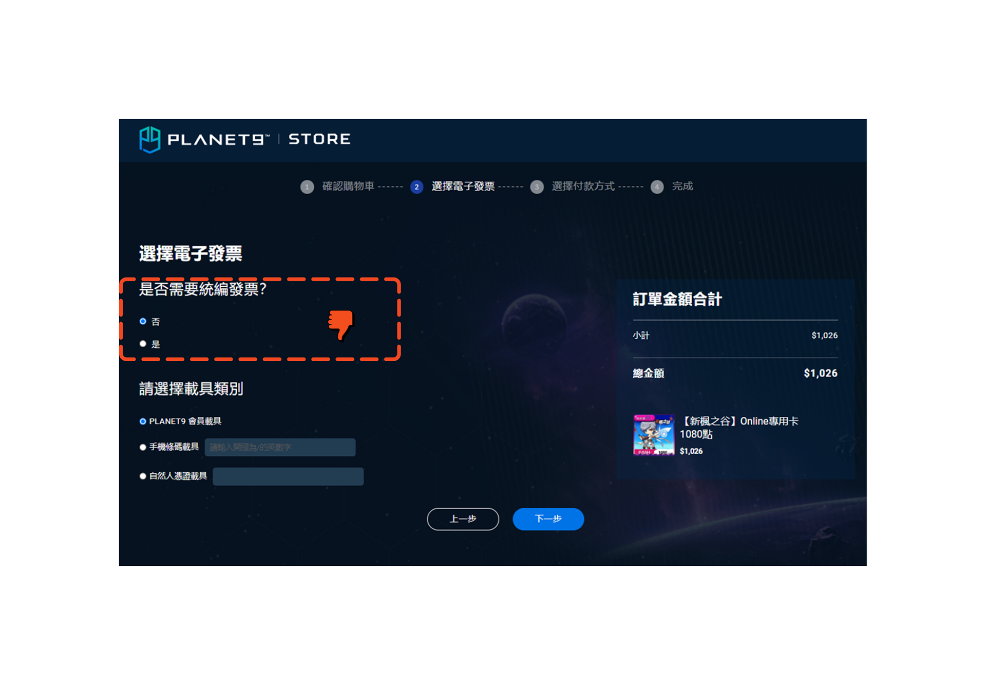
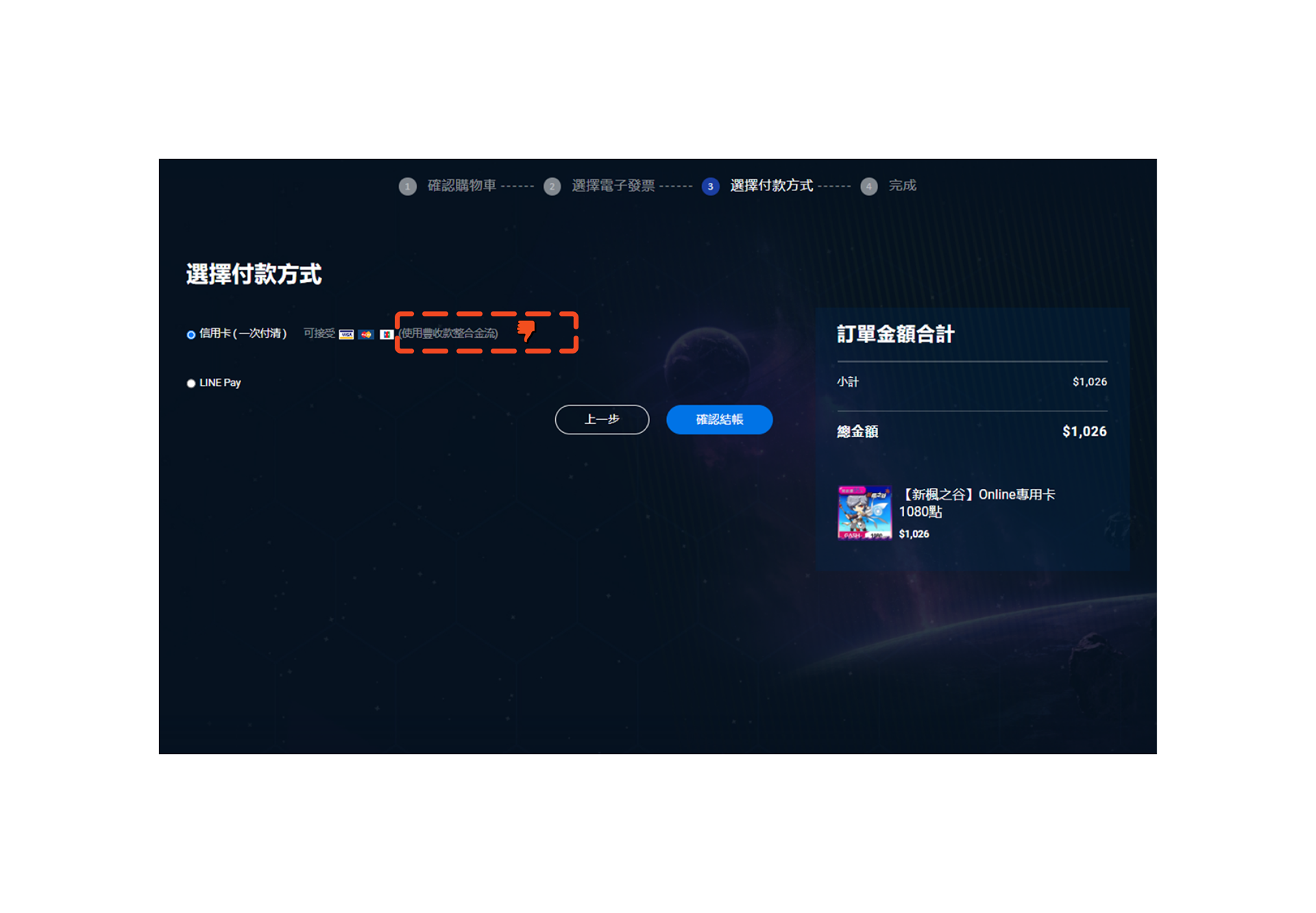
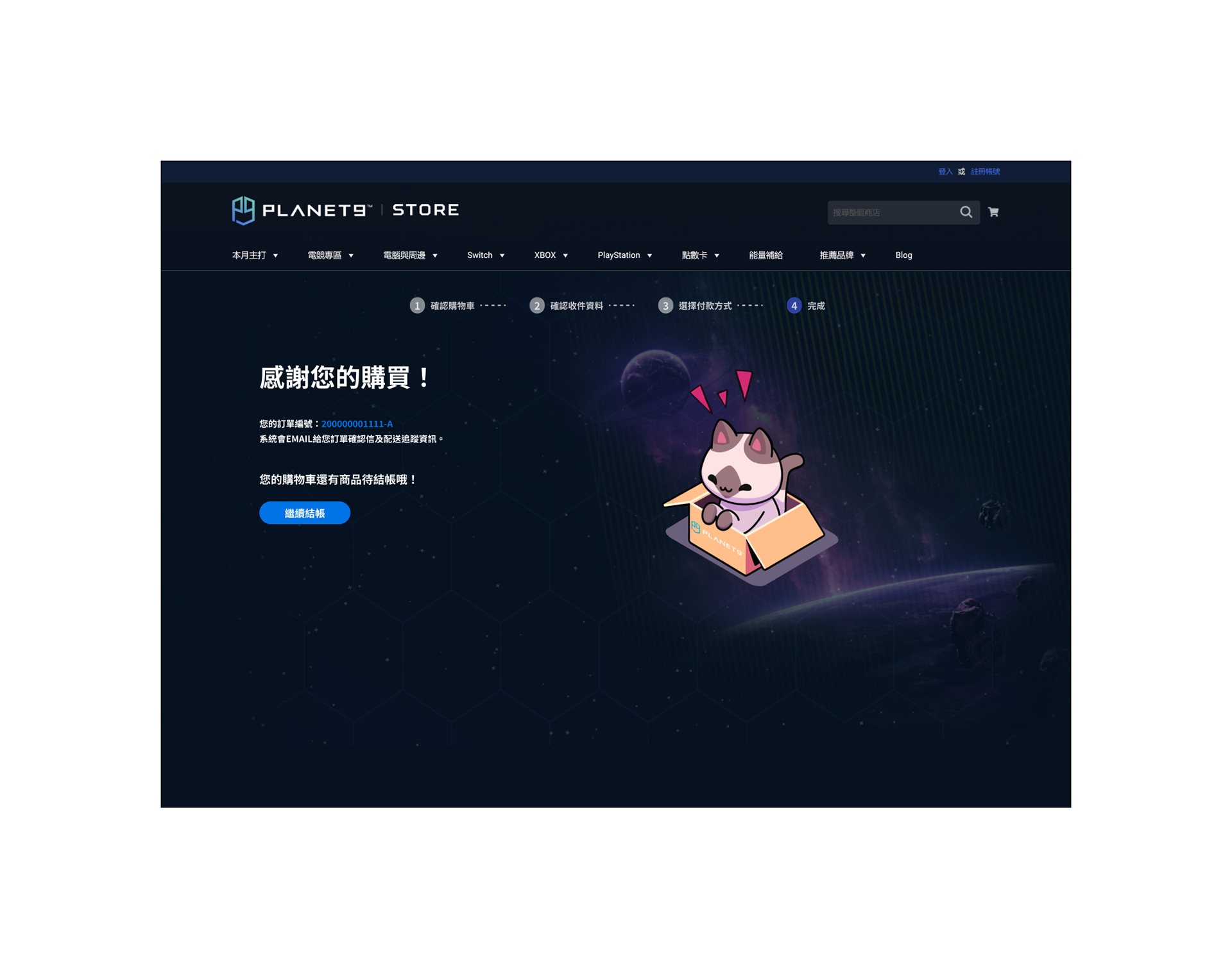
Checkout Process
Our previous checkout had 5 pages, which was very redundant and caused a high drop-off rate.
After researching our competitors and reviewing typical e-commerce designs, it's crucial to minimize the fatigue, as a result of discussions with my product manager, shrinking our checkout process to 3 stages is our first approach.
Previous Checkout 5 Pages
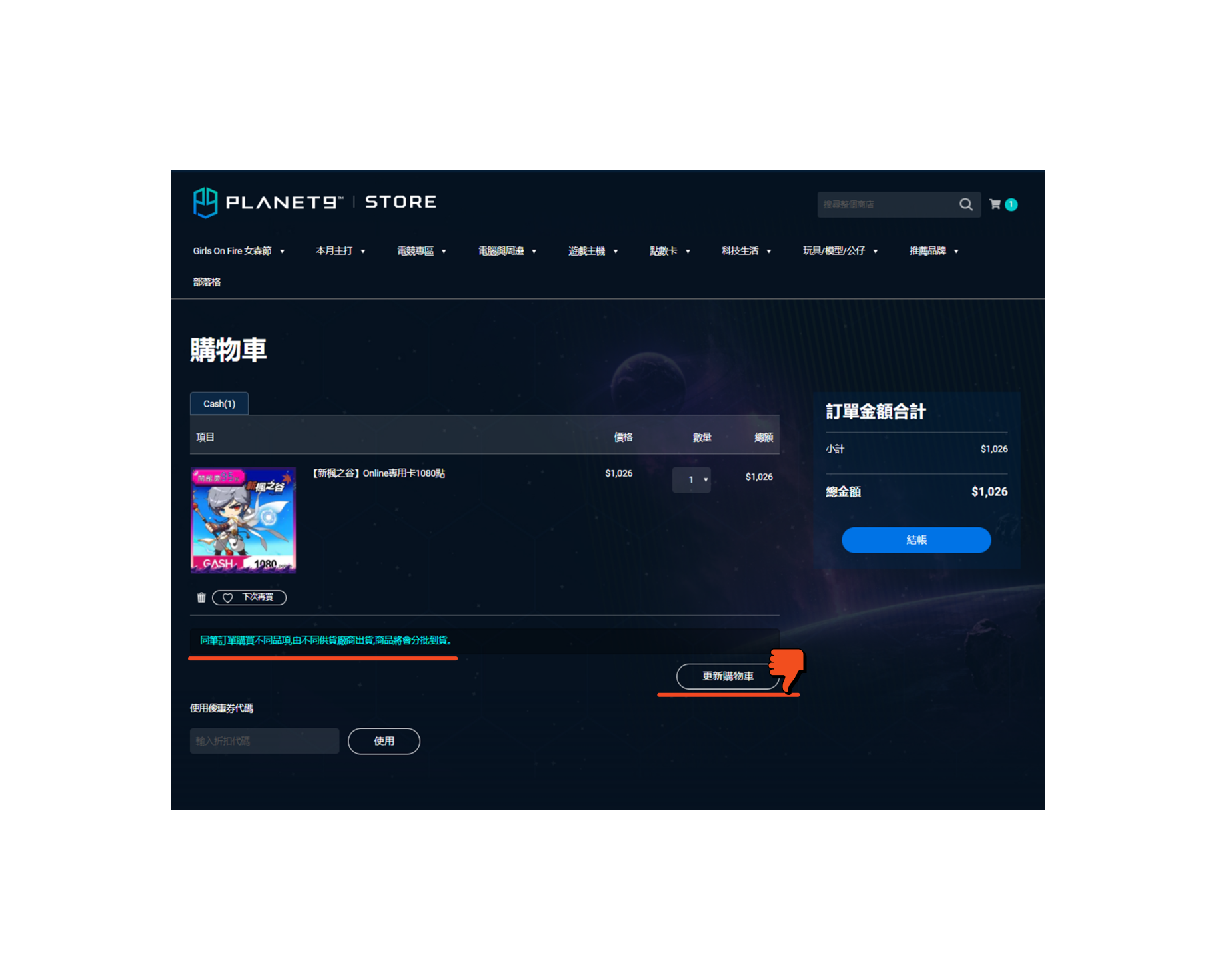
Cart
Delivery
Invoice
Payment
Complete
Process Breakdown
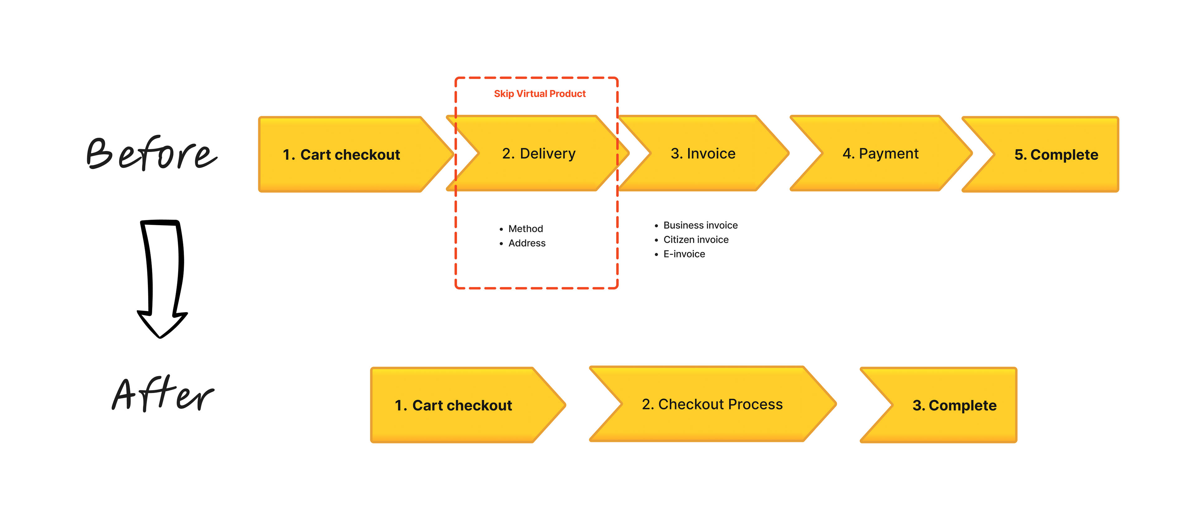
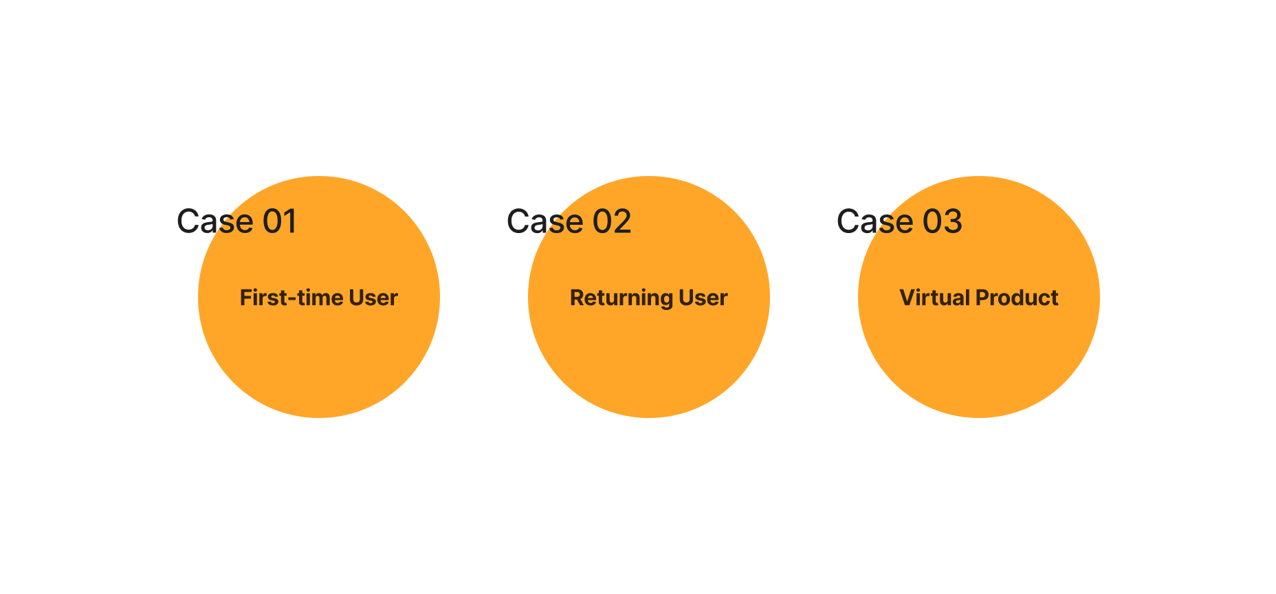
I identified 3 main cases for the scenarios that I will need to design.
There may be different user interfaces for first-time and returning users, and a delivery address is required for physical products.
We also have virtual products, such as game point cards, that will be sent to the customer's email without requiring an address.
Wireframe & Testing
I created the first version of wireframes for the use cases and conducted an internal physical moderated test with a group of 7 participants from our Store Operations team. The team included members from merchandise development, customer service, engineering, and QA.
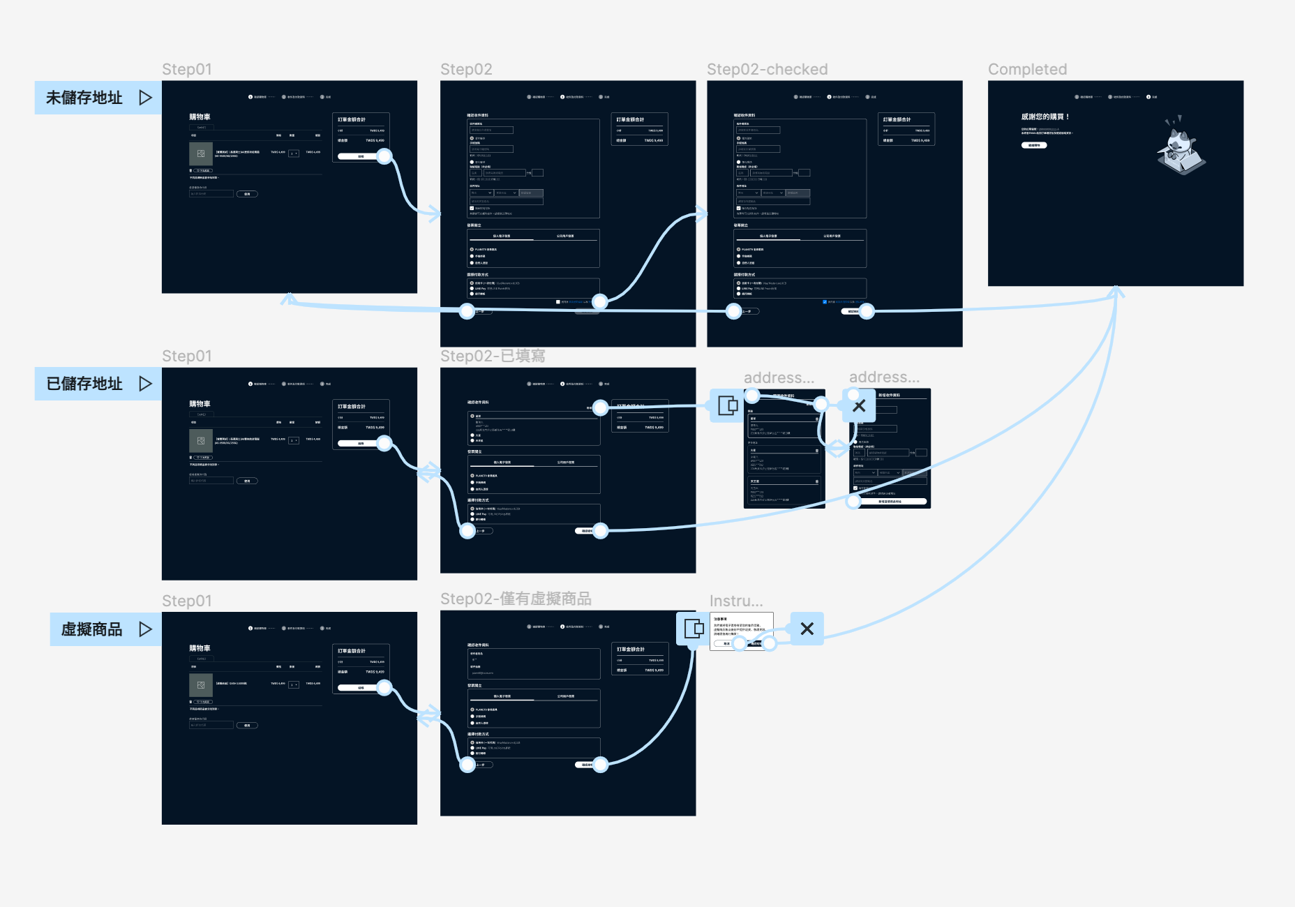
Iteration & UI Mockup
After the initial wireframe testing, I collected valuable feedback from the participants.
While some of the issues were minor and only required minor adjustments, I refined the UI mockup based on their feedback. I then conducted a second round of testing, which included mobile screens.
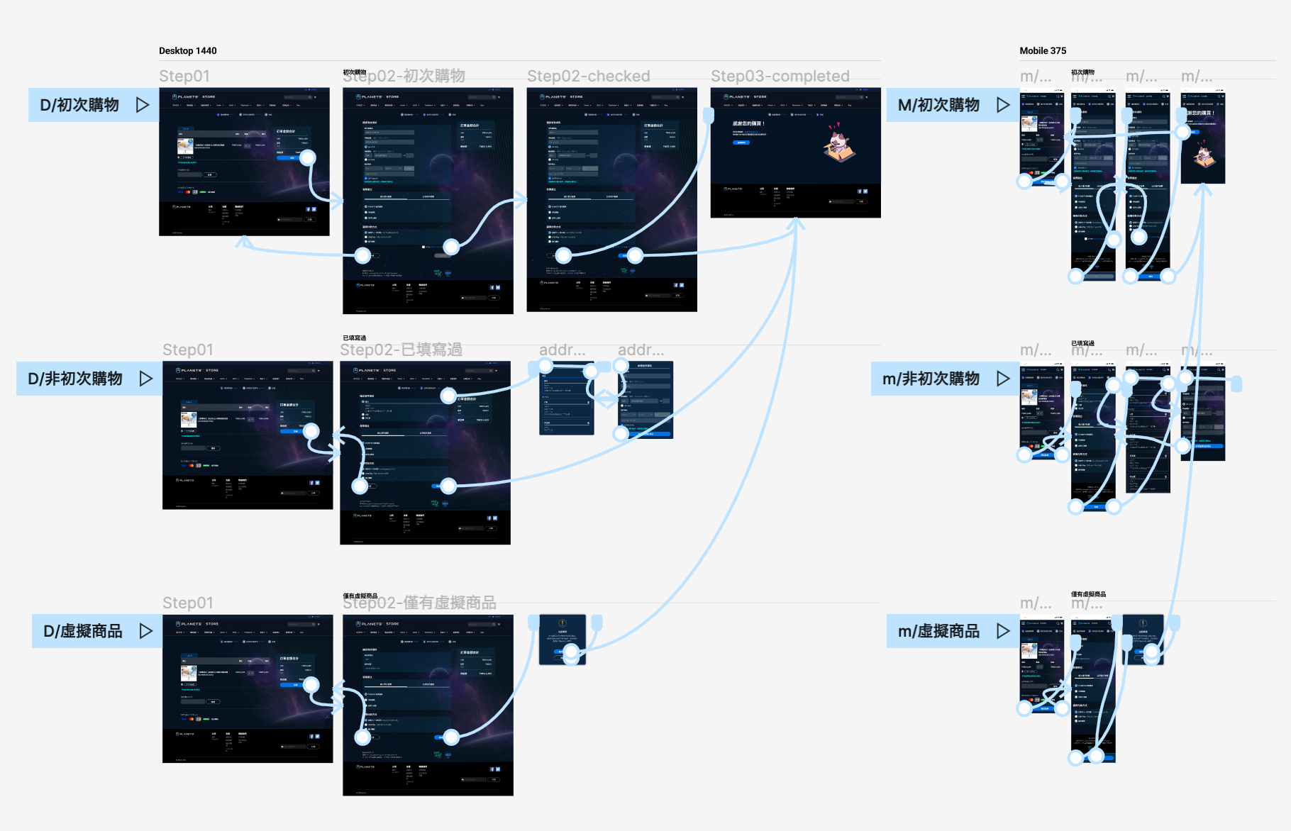
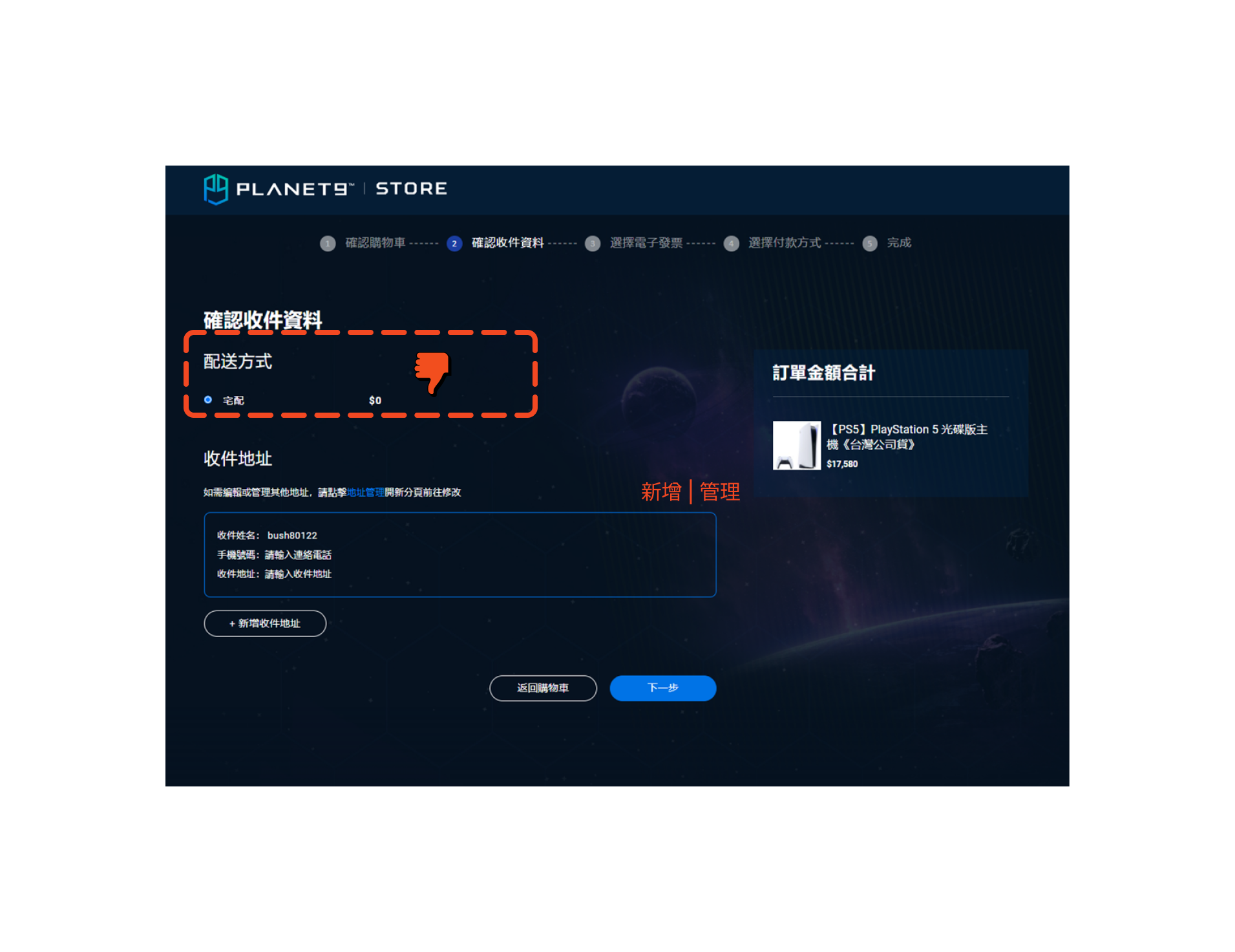
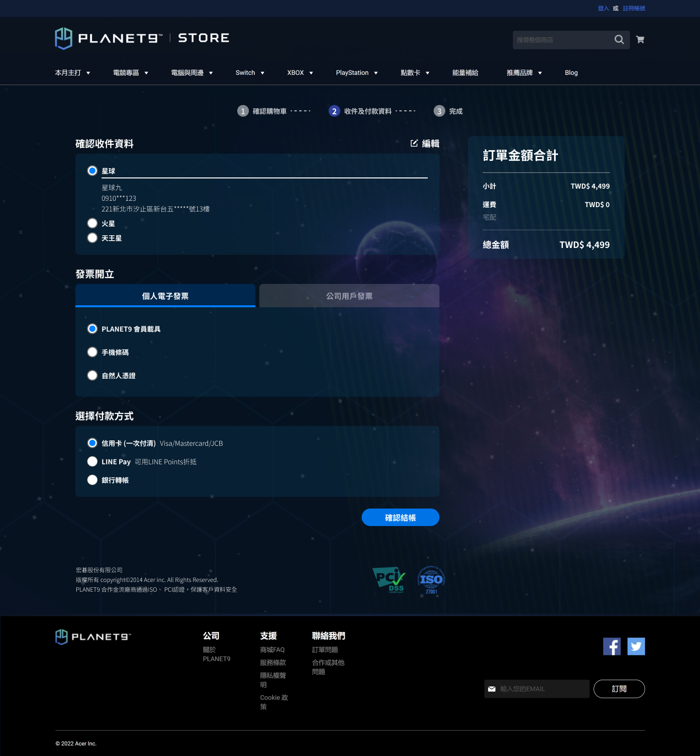
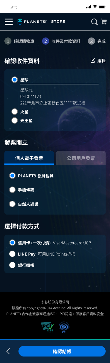
Here is a closer look at one of the selected screens - step 2 of the checkout process.
I merged delivery information, invoice options, and payment methods into one page and removed some unnecessary information from the previous design.
Interactive Prototype
Product & Product List
Competitive audit key insights /
- Clear Call To Action, layout and product specification
- Featured products
- Promotional ads
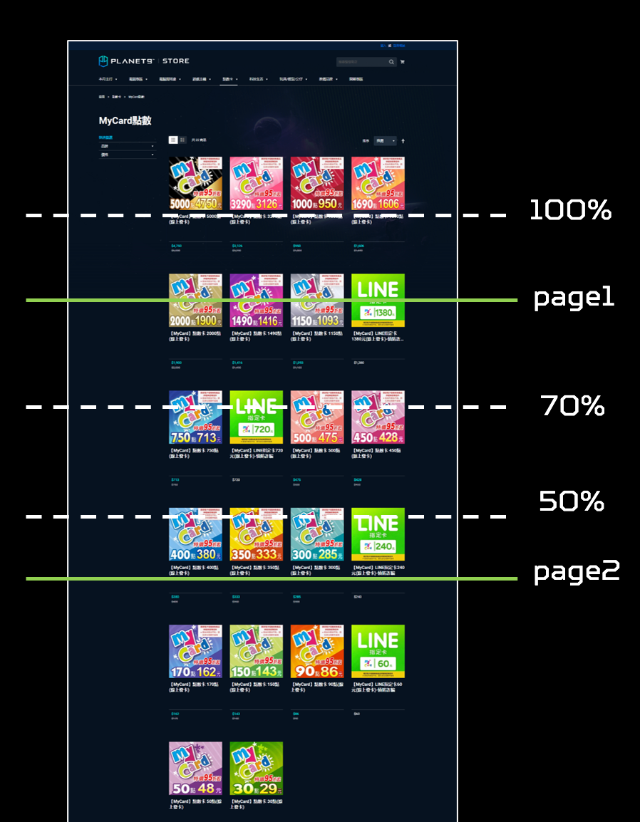
The scroll depth of the product list, monitored by product manager.
Interactive Prototype
Result
Improved shopping completion rates by 6.2%
and reduced drop-off rates by 9.4%
within two weeks after launch.