Overview /
Astrorg is an agency with focus in astrology and product development,
and their client, Jesse Tang is the most famous astrologer in Taiwan.
In this project, my duties were taking over all the design tasks from a former designer. I was the sole UI/UX designer in charge of the checkout flow from scratch and finishing off all the details to complete the project and launch v1 online under a tight timeline.
Agency: Astrorg
Client: Jesse Tang (DaMou Entertainment)
Former designer: Lina Li
Team: Product Manager / Front-end Engineer / Back-end Engineer / Sales Director
My role: UIUX Designer
Deliverables: Information Architecture / User Flow / Wireframe / UI Mockup / Prototype / RWD Design...
Duration: 3 months
Tools: Figma / Miro / Invision / Loom / Microsoft Teams
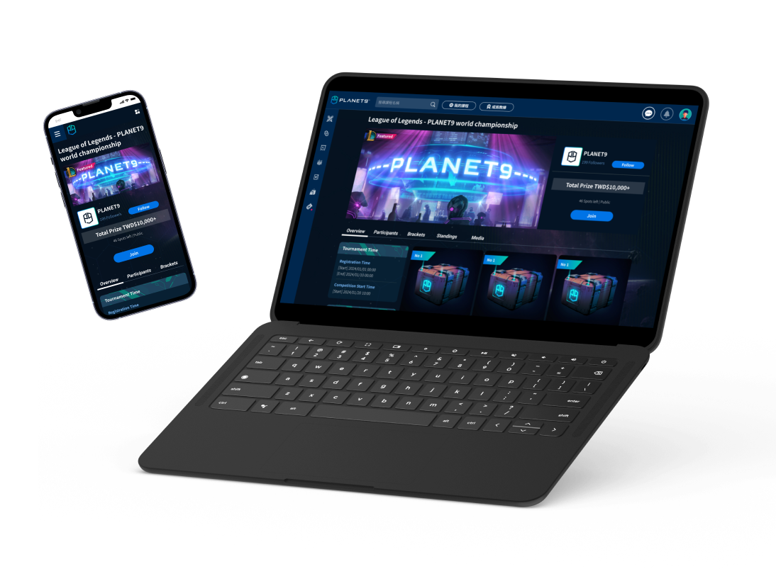
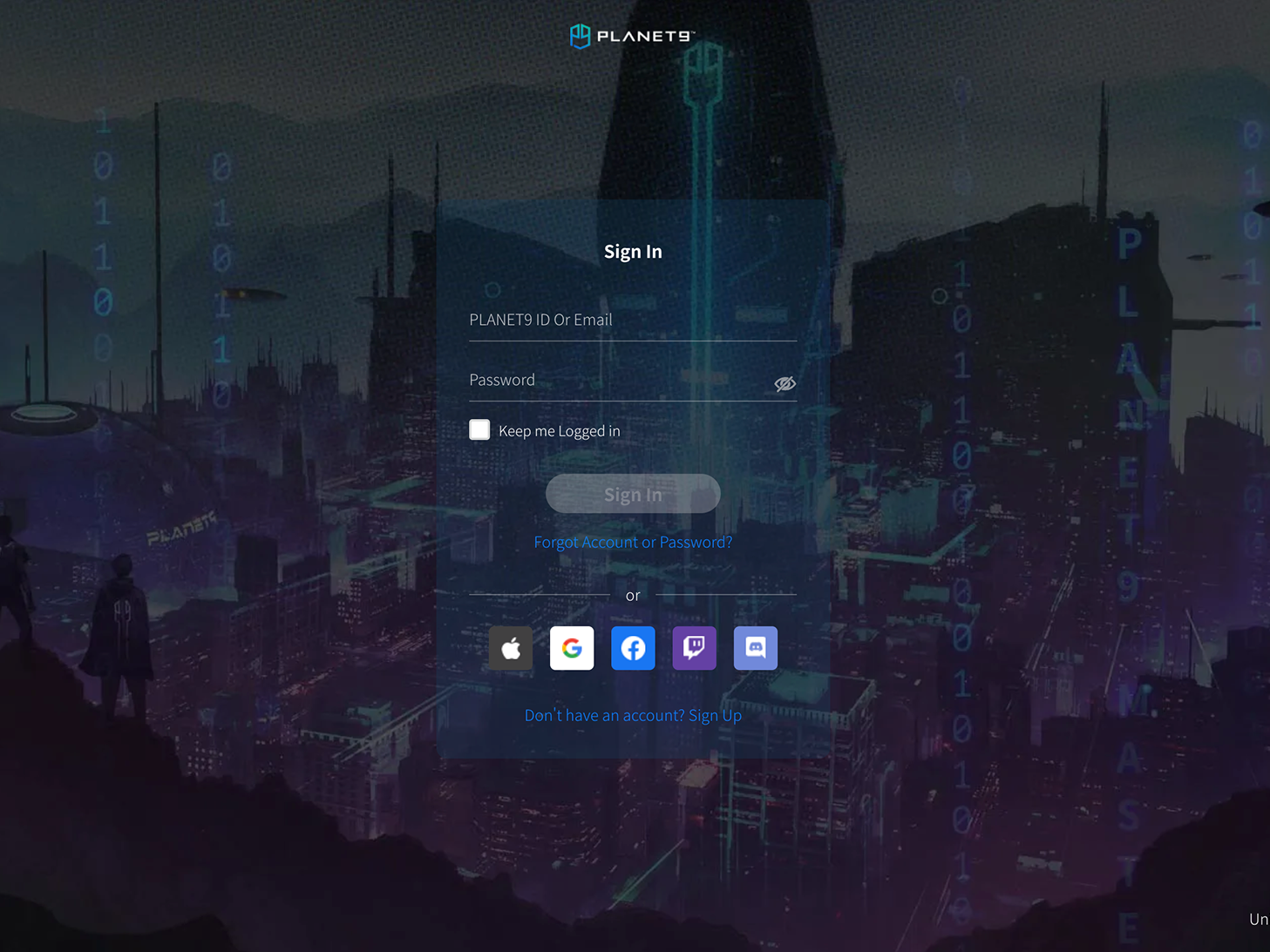
Website:
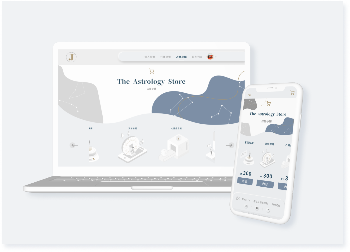
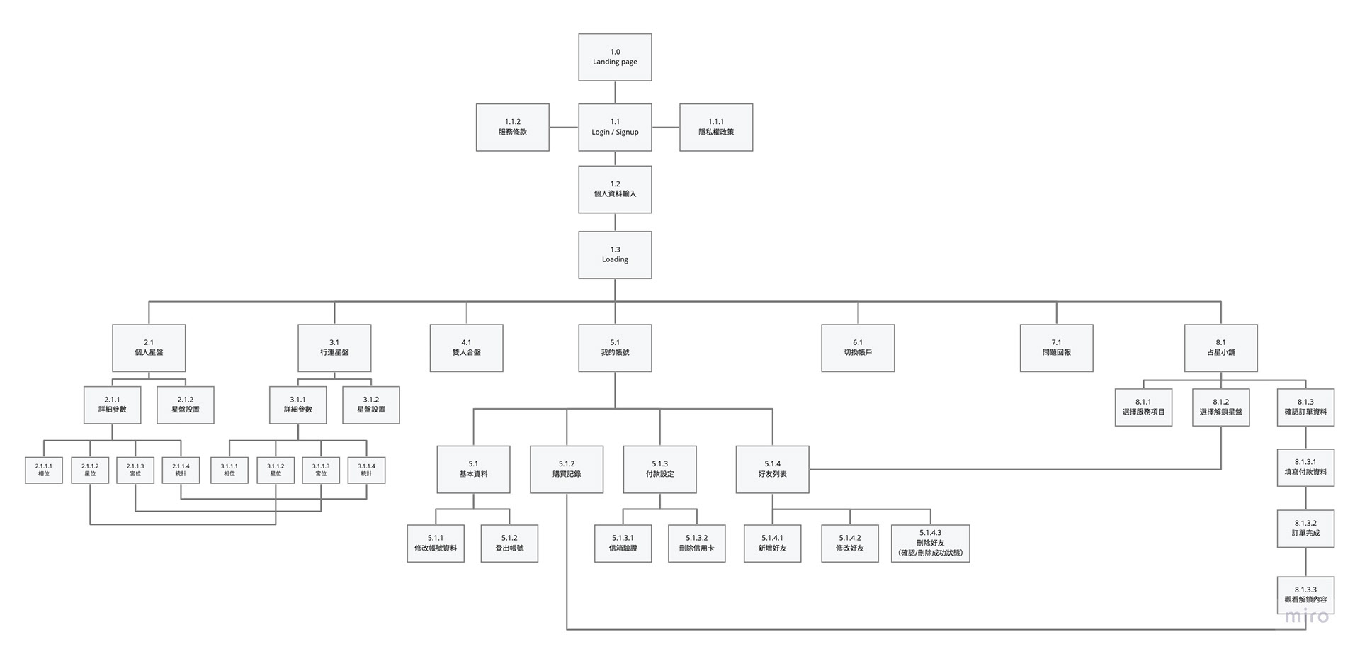
Sitemap
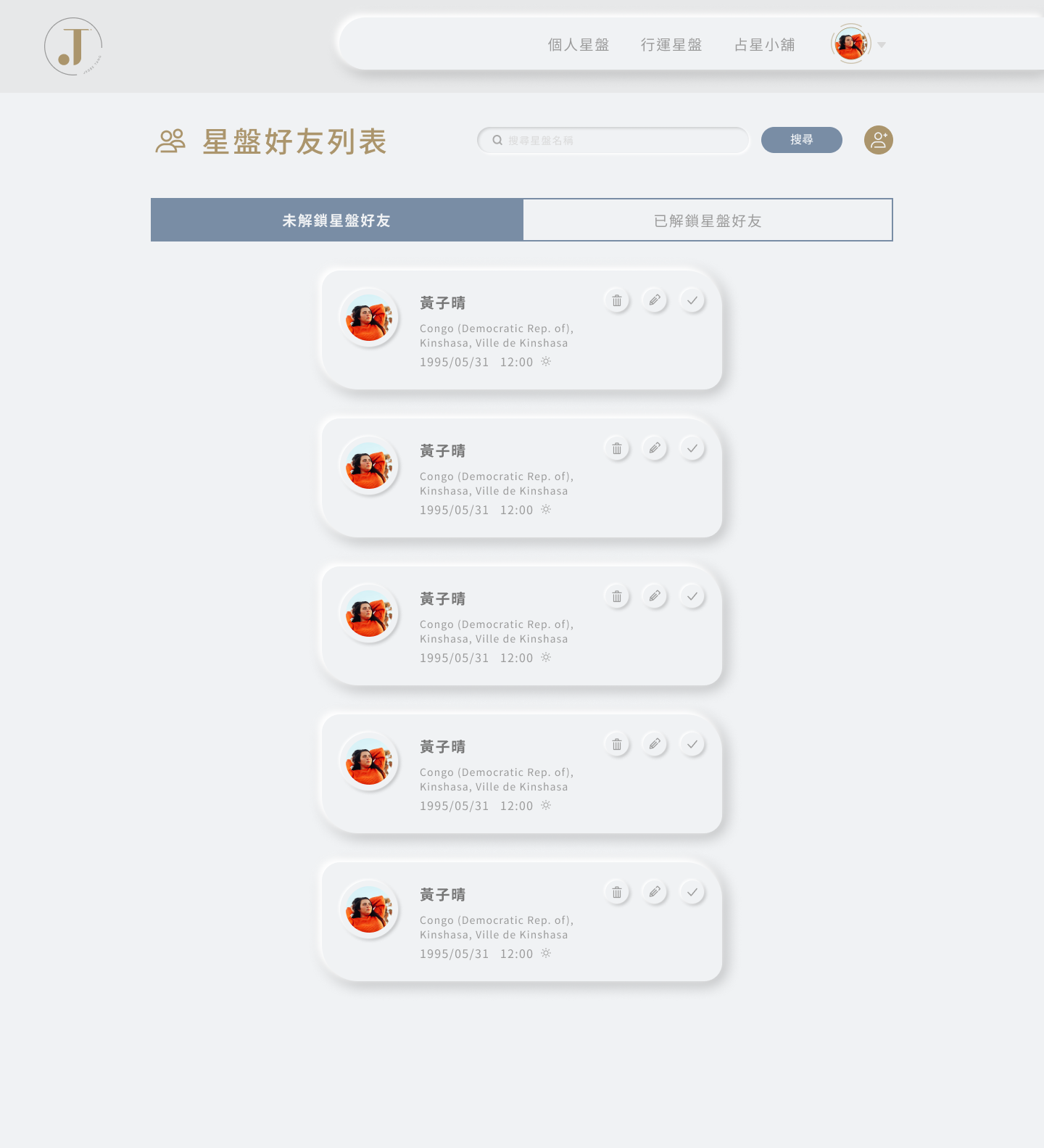
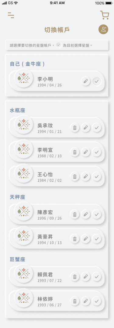
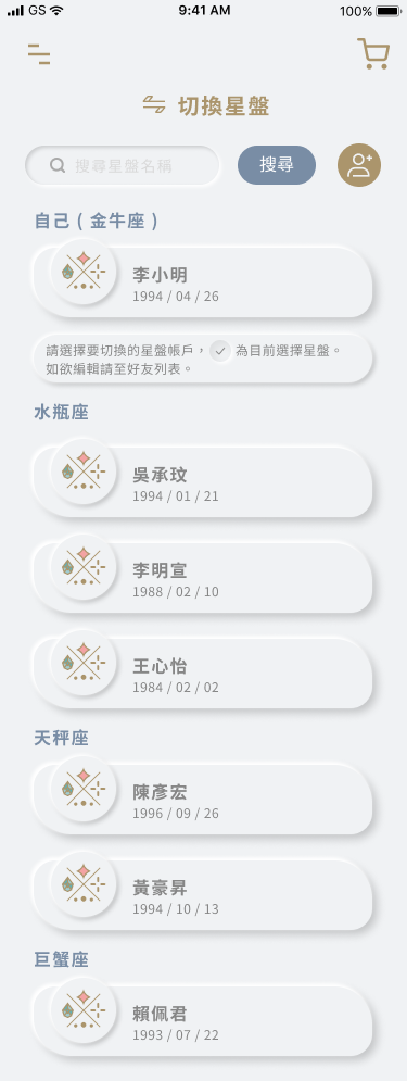
The main features are ''Personal Astrolabe'', ''Friend's Astrolabe'', ''Astrology Shop'', ''Adjustable Charts''.
Functional Flow & Wireframe
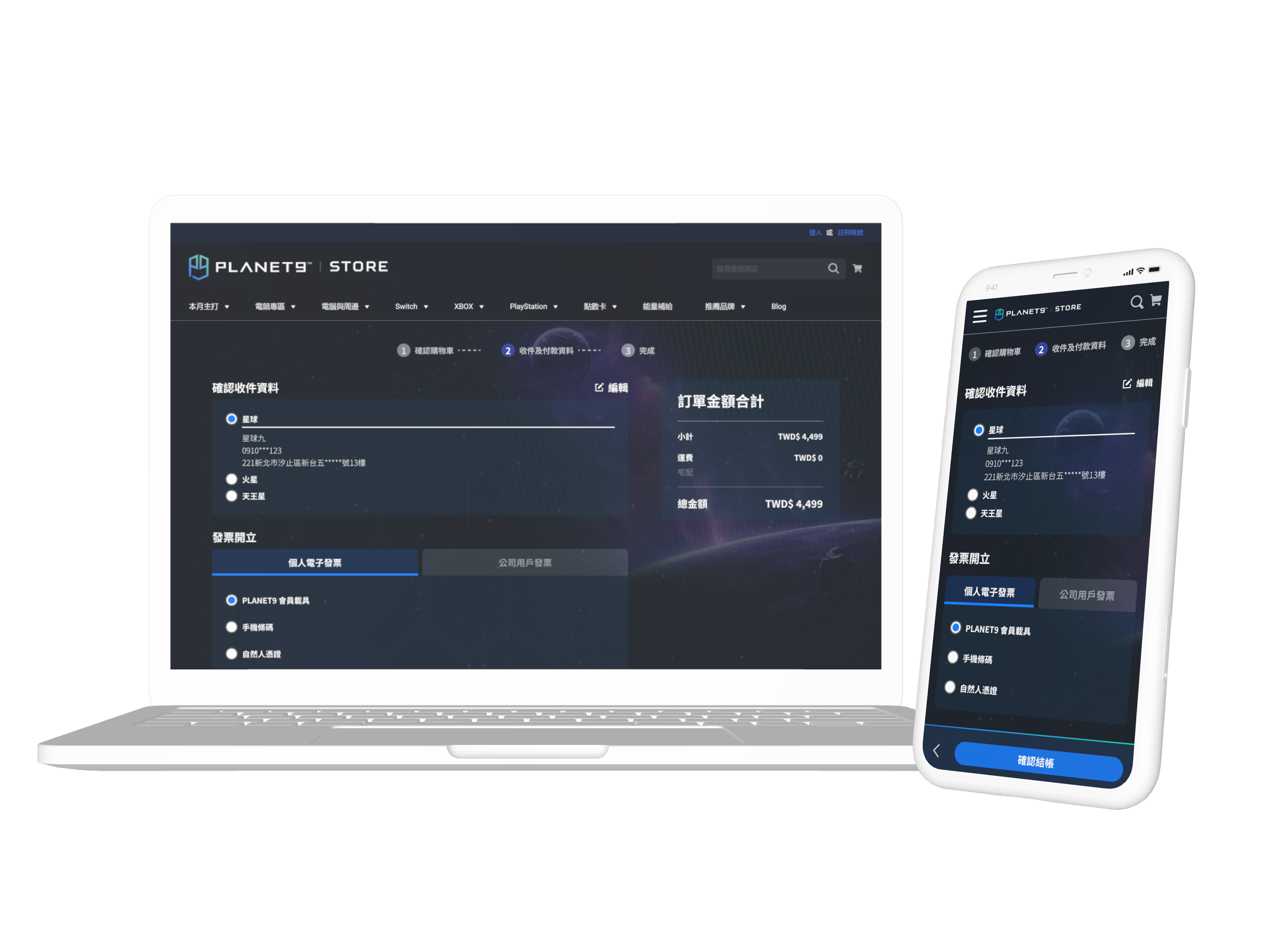
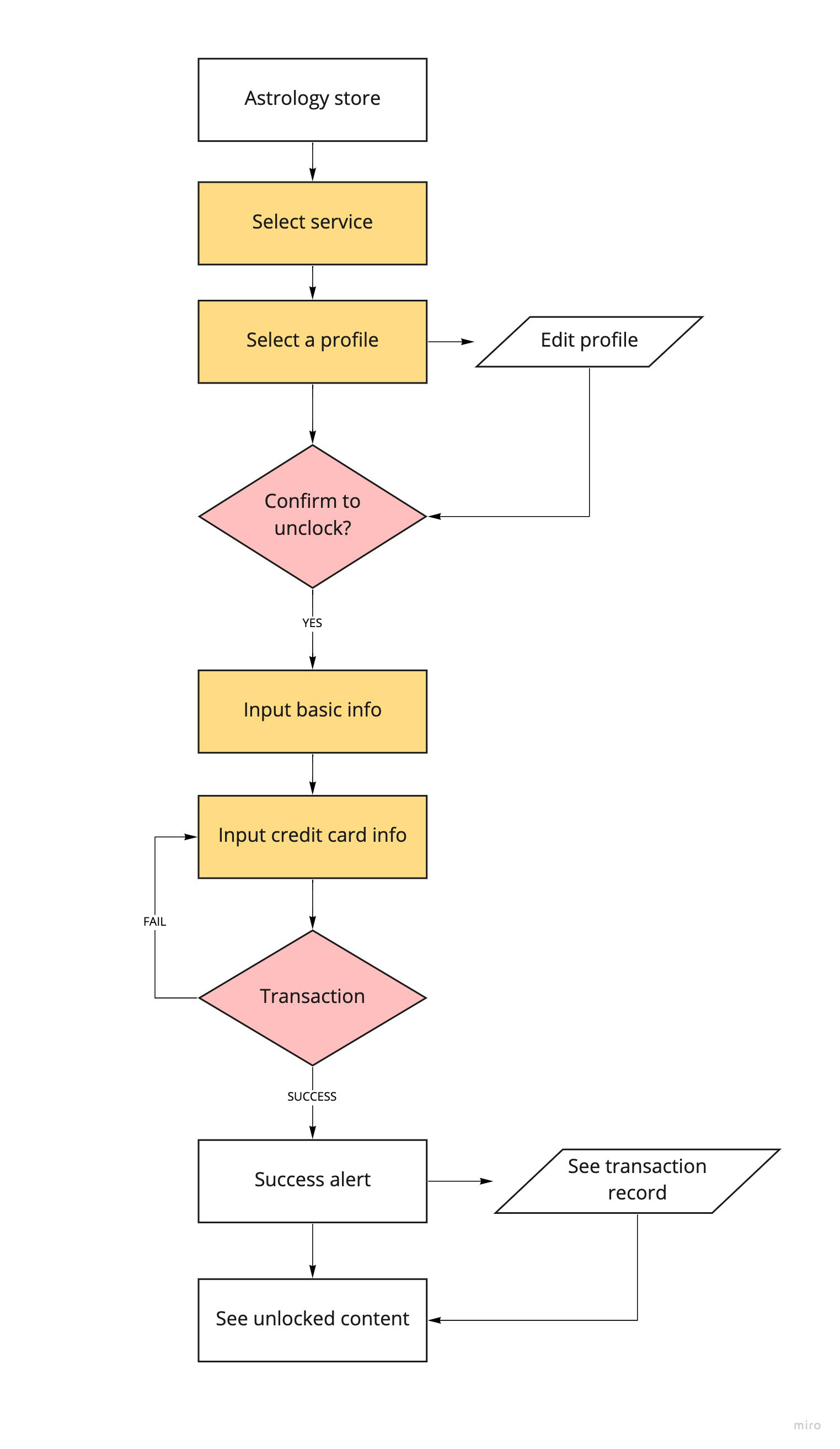
I mainly took the payment part from scratch.
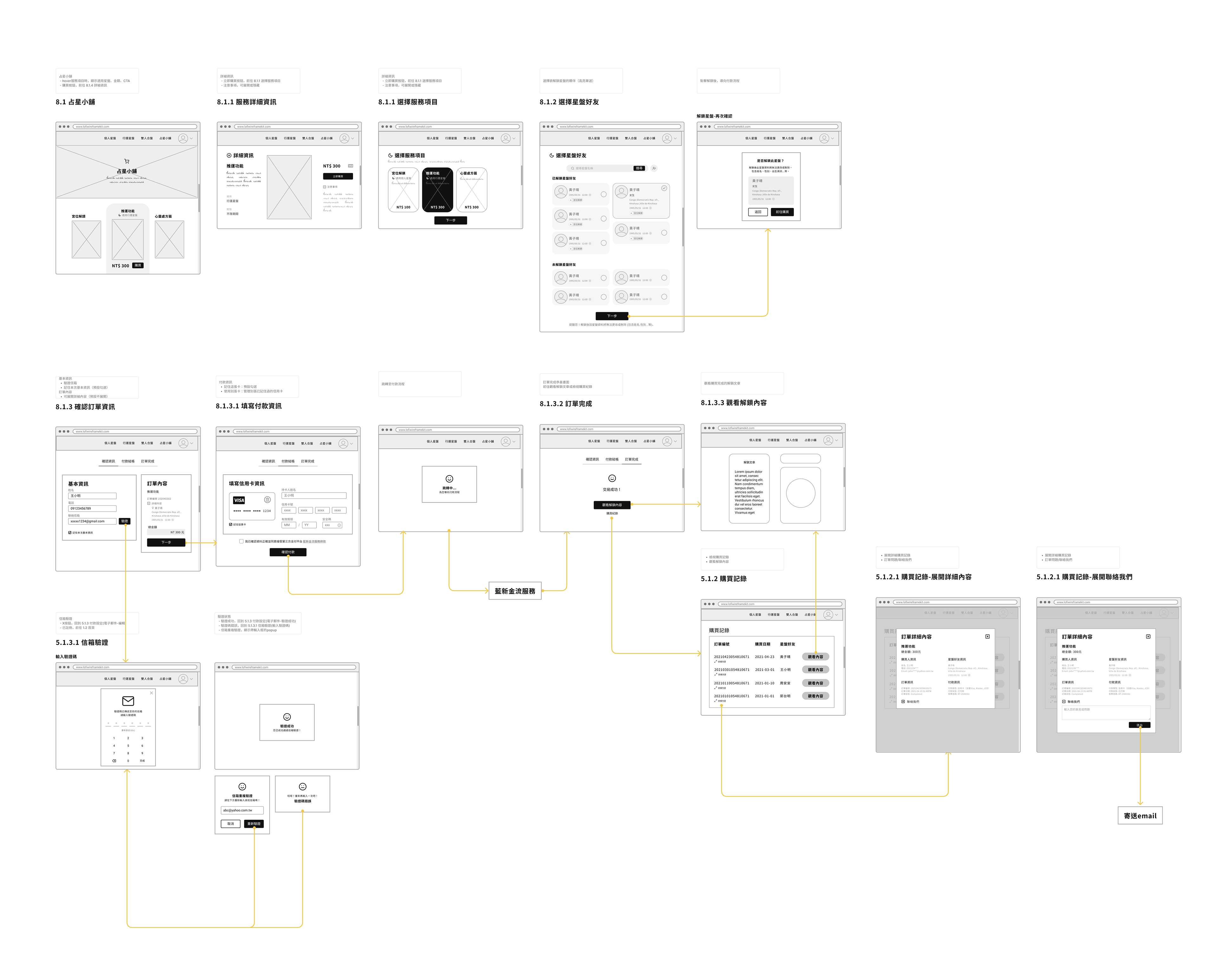
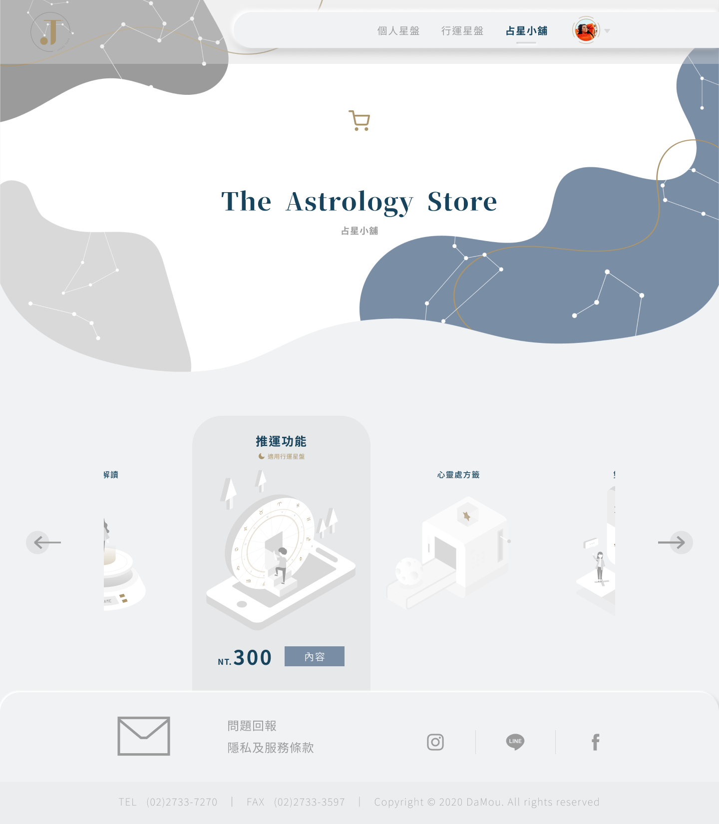
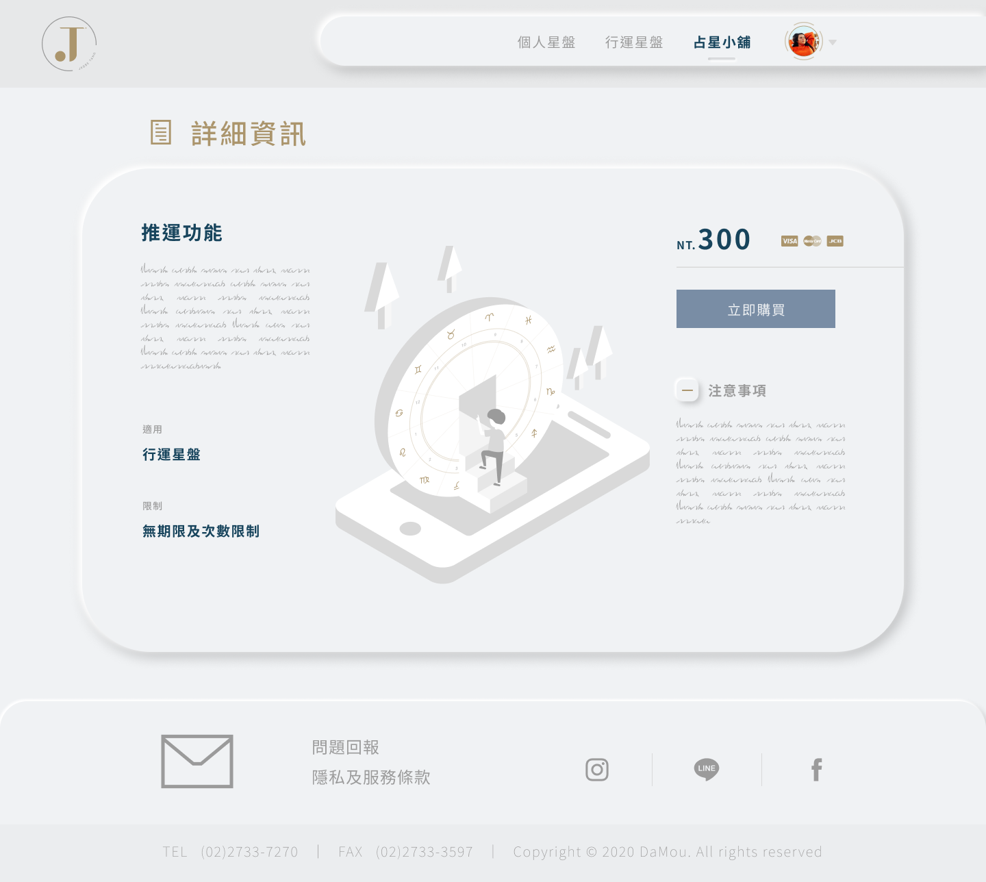
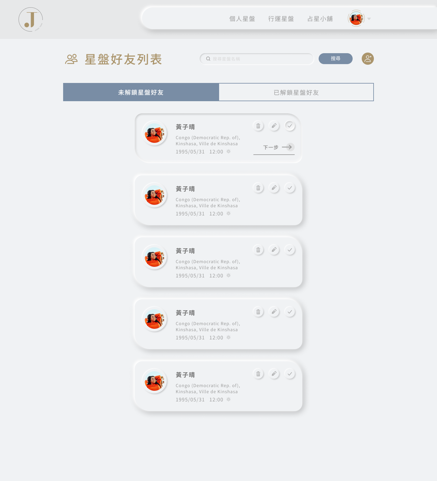
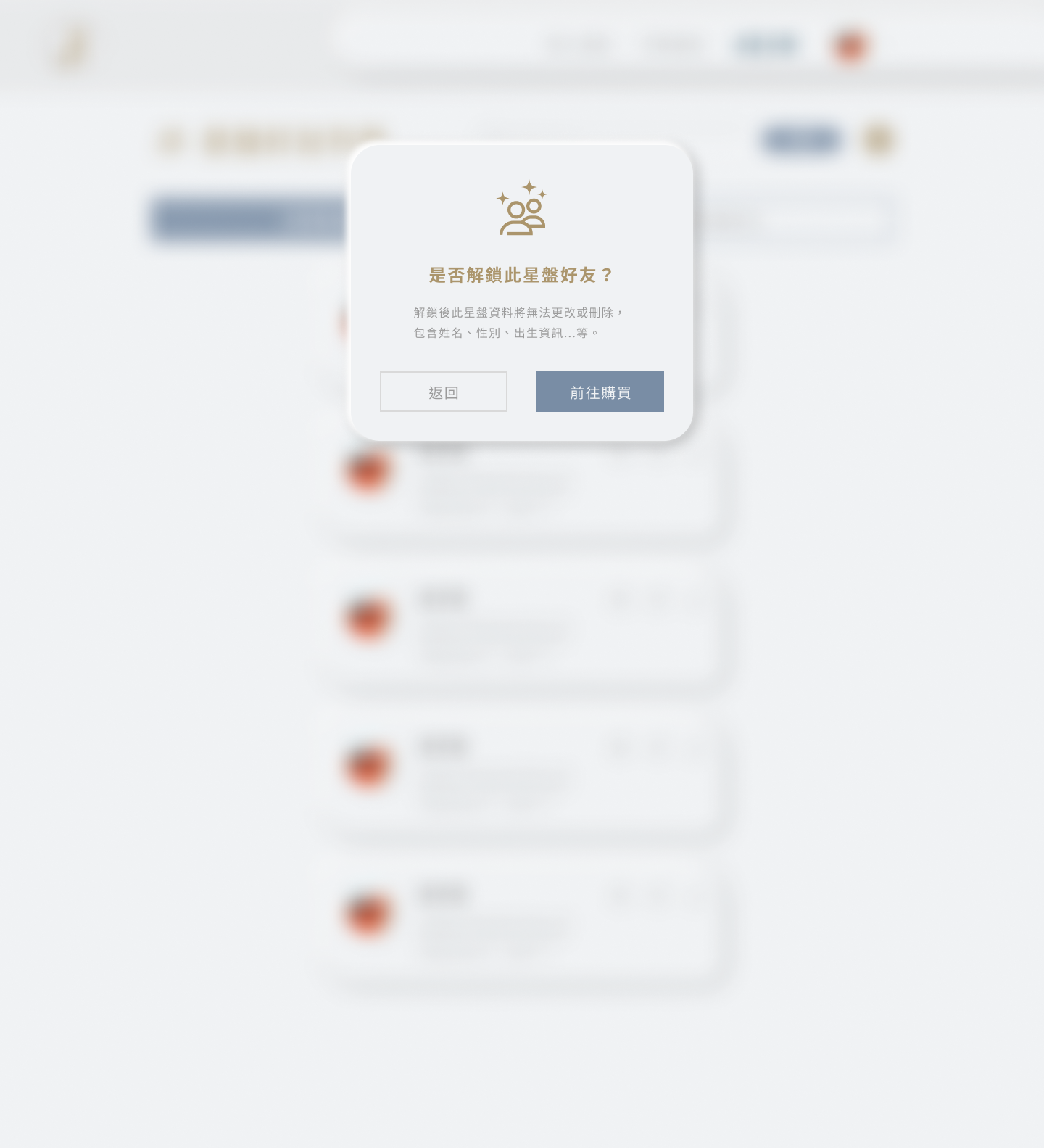
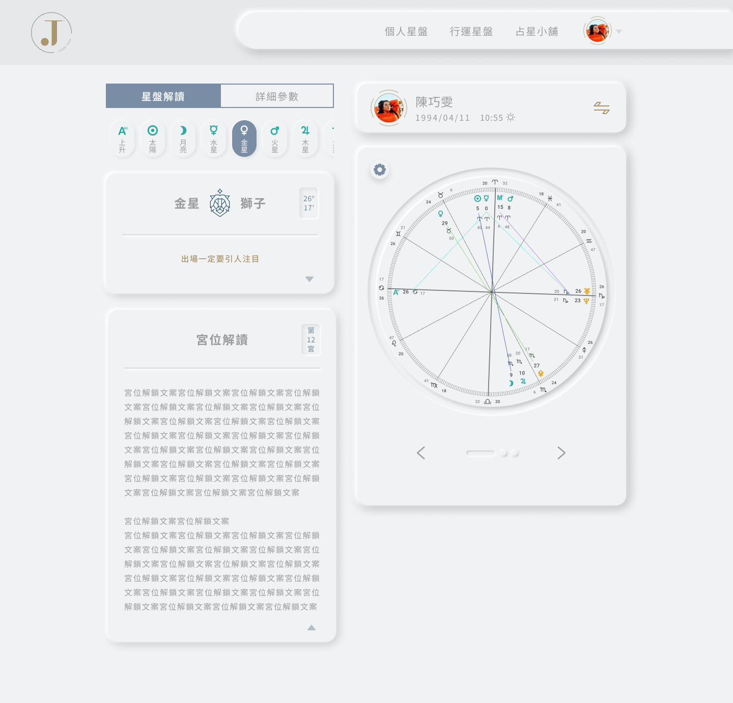
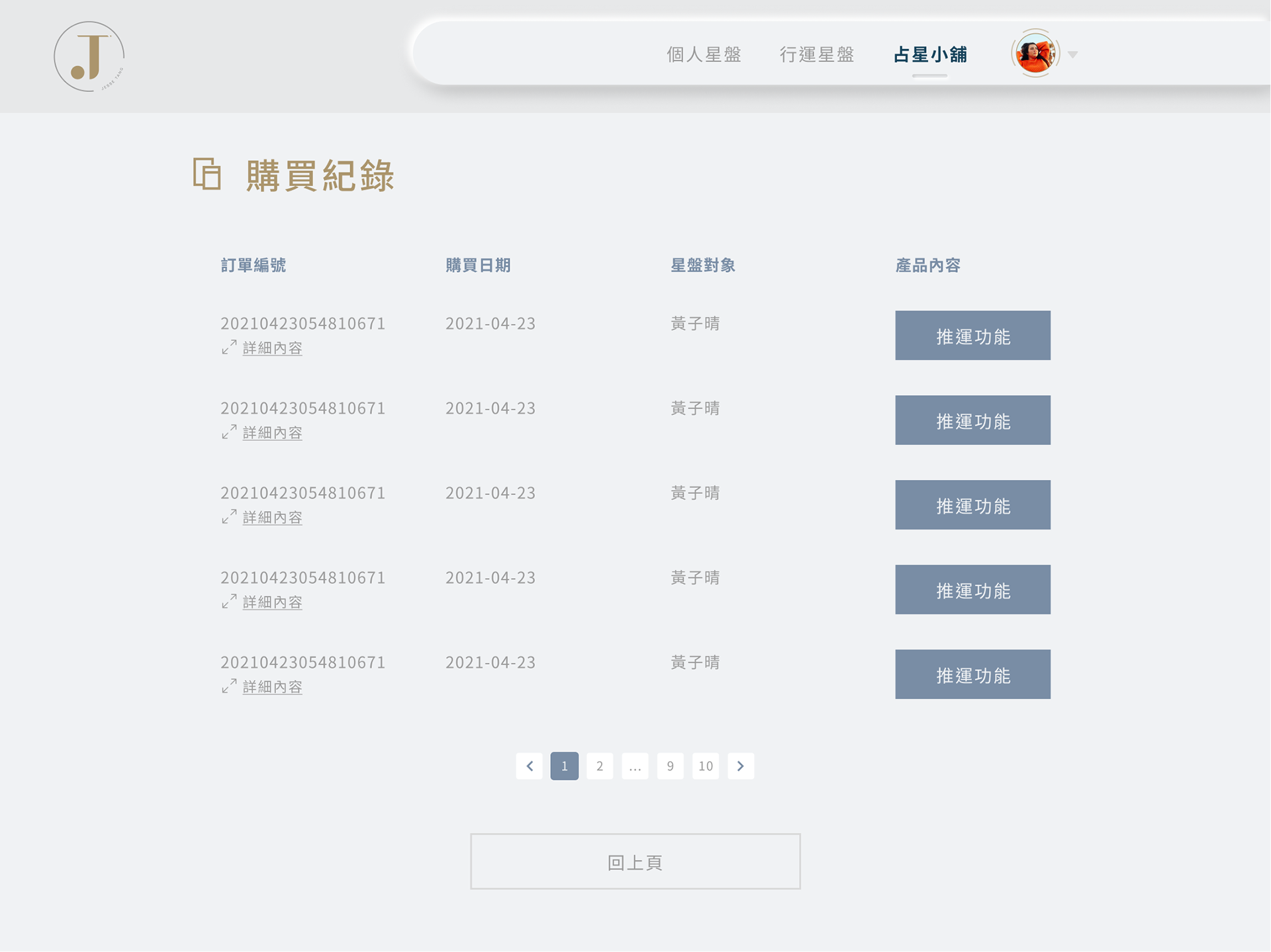
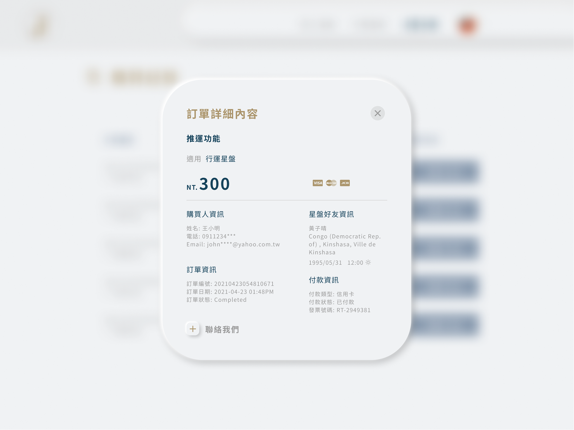
The primary service in the Astrology Shop is ''to unlock the explanation content of the astrolabe'', the user can choose either to unlock their one or their friends' to purchase.
Challenges /
The previous idea of the wireframe created by another designer above is "topping up points" so users can spend, however, this idea was abandoned after several discussions with the engineering team and the client, I improved the new user flow and change to the ordinary checkout process, main reasons are below:
1. This is a new service so users are new and not yet familiar with the rules, it's unlikely for them to spend too much on points.
2. From a technical aspect that costs more effort and time to develop, and the launch deadline is there.
3. Keep the process simple.
Before (V1 wireframe)
After (V2 wireframe)
Trade-offs /
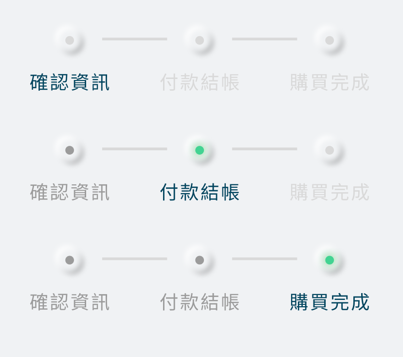
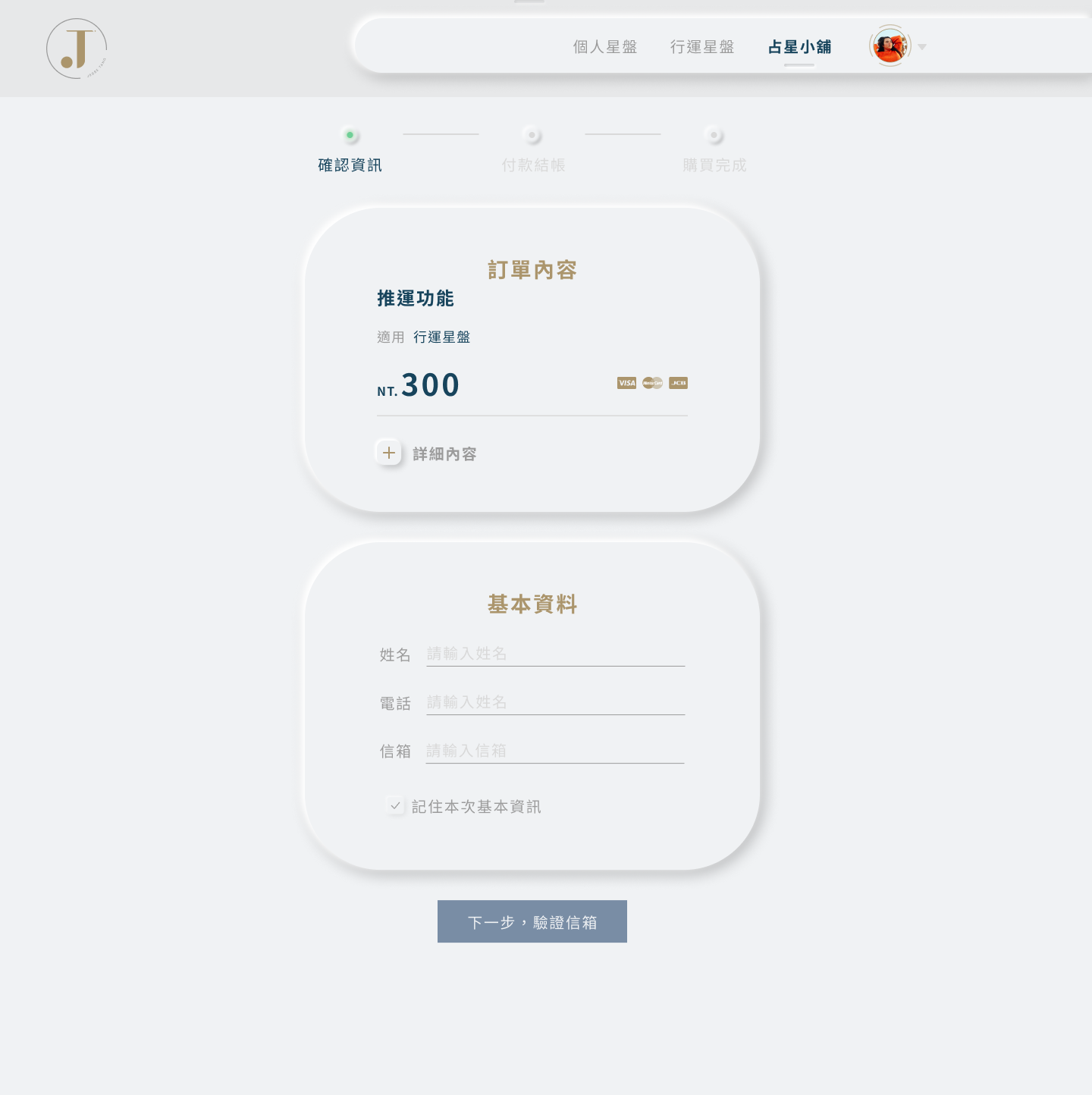
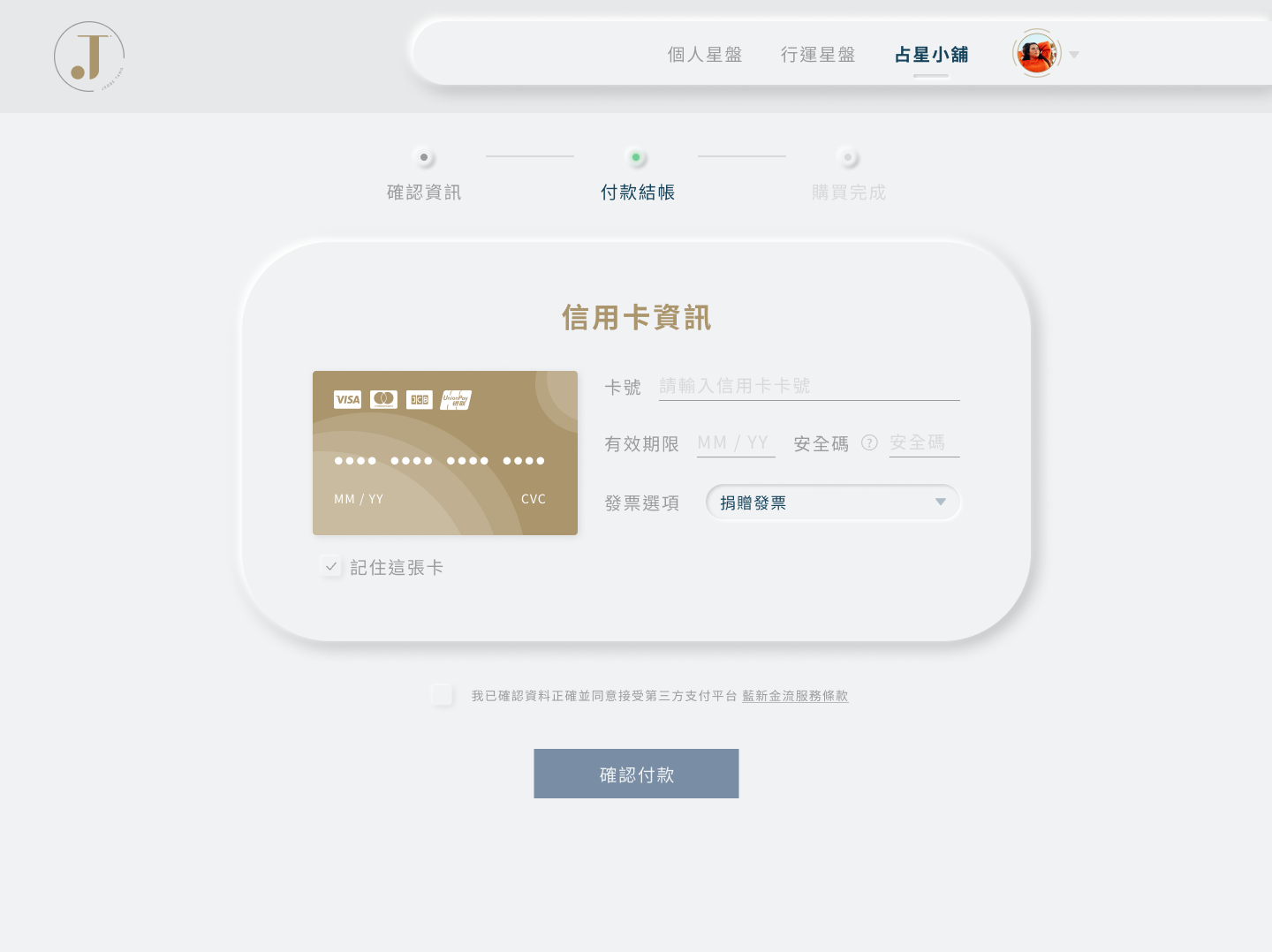
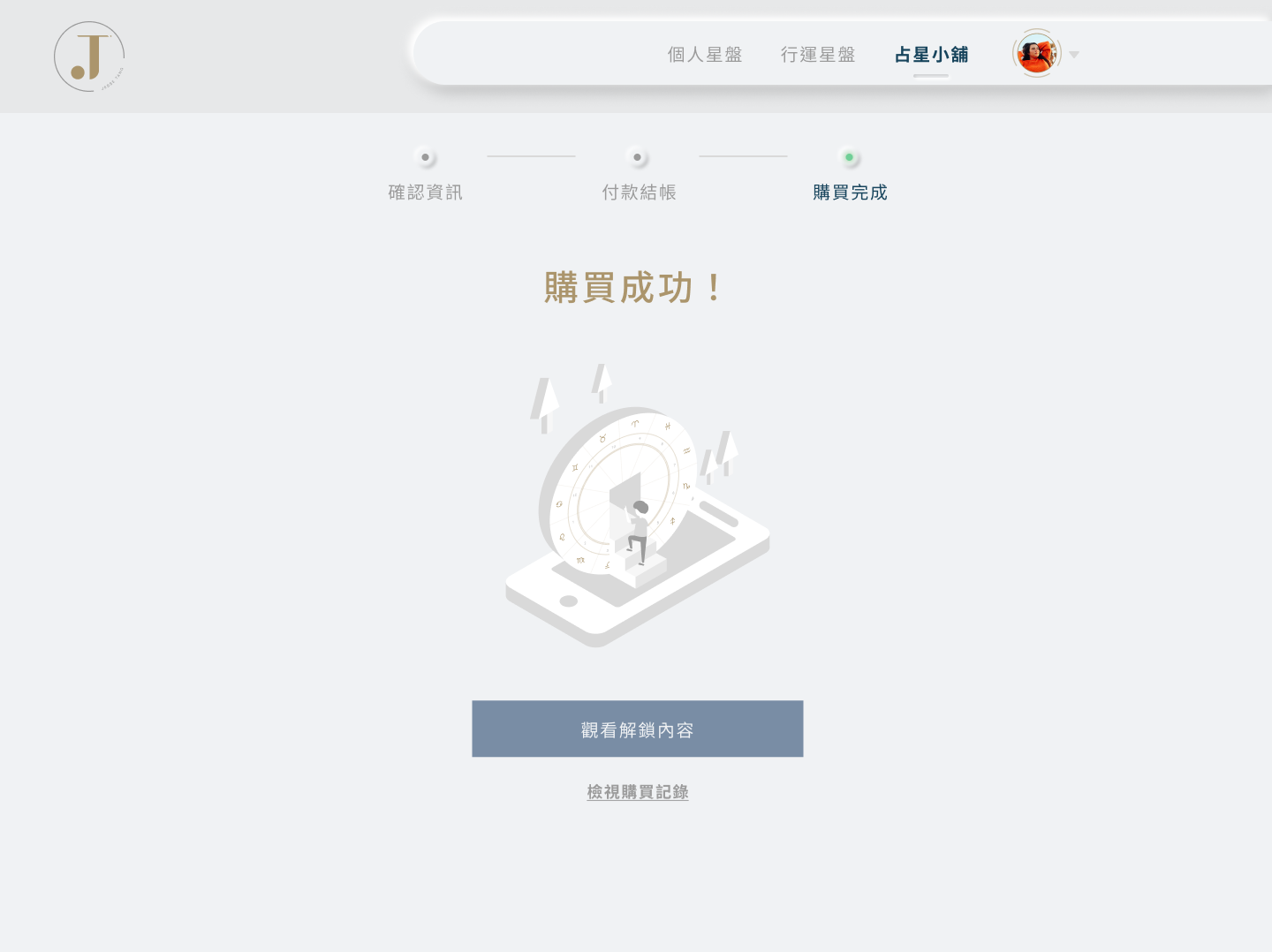
Regarding the checkout process, I divided it into three pages.
Regarding the checkout process, I divided it into three pages.
The solution I compared initially was to decide whether break it into several steps or combine everything in one page, the reason I finally choose three steps is many pieces of information require the user to input, it's pretty exhausted yet if breaking the steps for fewer actions can reduce tiredness.
I added a progress disclosure bar. Each of them is named ''Basic information'', ''Payment'', ''Completion'', the green color signals the status.
According to the UX principle Goal-Gradient Effect, a progress disclosure could motivate the user to complete tasks.
It is also worth noticing that some required information like name and email, if the user has previously used this service, the system will remember it so the user doesn't need to input them all again.
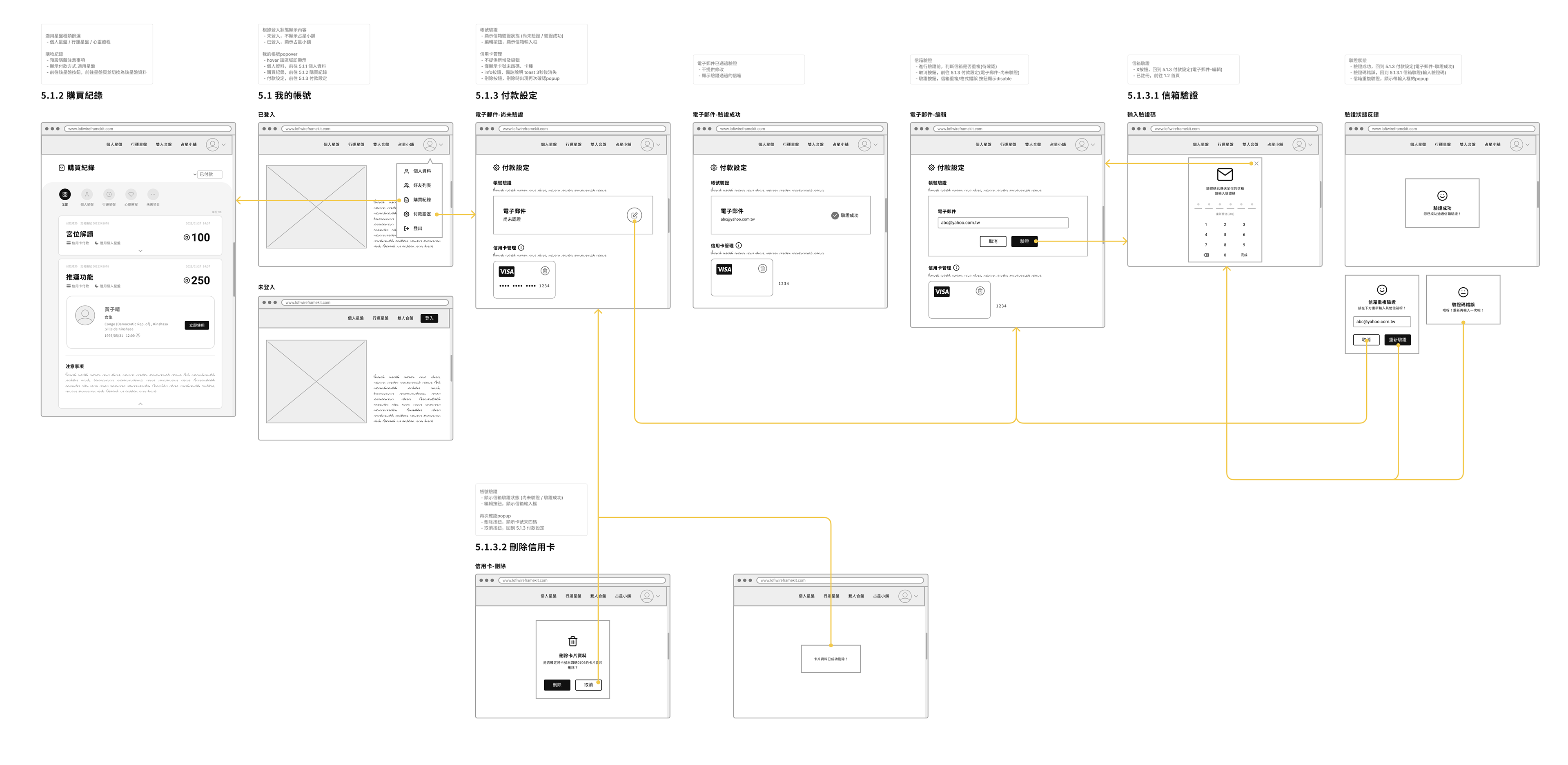
UI mockup
The detailed design handoffs to development.
Most of the UI guideline and visual styles has already defined and the client has approved, I added some new components in consistency with the style. I also did some work to organize the design file inside Figma for easier maintenance.
After a few iterations, here's the final UI design for the part I was in charge of.
Development /
About how I hand off my design to developers.
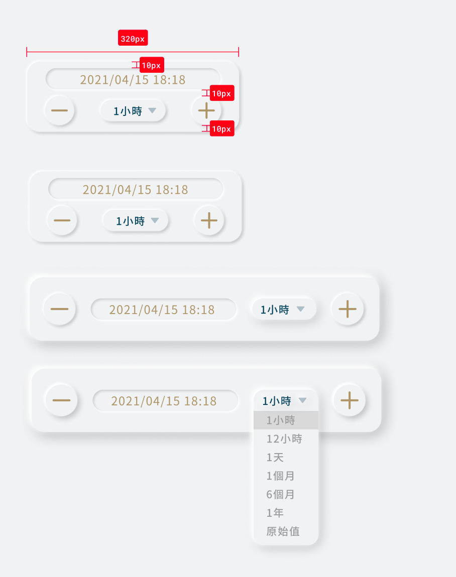
Normally, I wouldn't do extra work to redlining because Figma already has very handy tools for dimensions, but if some new components are added later or some details I need the developer to take care of, I'd try this way for spec and communicate with them.
Prototype
Other Details /
Except for the checkout flow, I also take care of other details of entire product.
For example, the original UI has some right angles of the squares, I eliminate the disharmony and did some layout to minimalism.
And my graphic design skill really takes the place for assisting key visuals, marketing materials or banners.
Before
After
Takeaways /
At the very beginning of this project, I have no in-depth knowledge about astrology, like astrology houses, how astrolabe works and such stuff, I spent a lot of time reading the documentation and everything I needed for this project within one week. Even though I don't have certain domain knowledge, one thing I think is very enjoyable being as a designer is that I can expose myself to different areas, and come up with solutions with design thinking.
During the design process, I brought different variations or videos to the meetings to explain my thoughts. I worked very closely with frontend engineer and product manager to make decisions and at the same time receive valuable user feedback from the client, it was also a very rewarding experience in learning stakeholders management.
Due to the contract and their commitment to the client, I did as much as possible to make it launch perfectly until the end of my contract.
Impact /
After the first launch, the product gained 80k visitors for the 1st week and reached 120k users in 3 months.
After the first launch, the product gained 80k visitors for the 1st week and reached 120k users in 3 months.